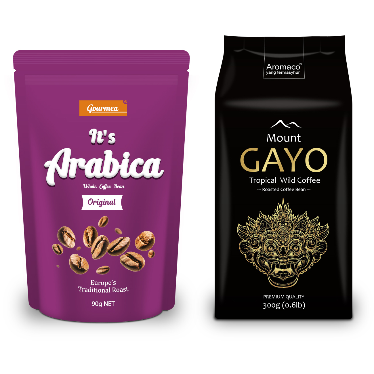
A successful food packaging design that is appealing, enggaging people, unique, authentic and meet what customer are looking for.
By referring to the above purple-shaded coffee packaging design it depicts impactful of coffee-related product with the flashing-bean yet bringing along the presentation of contemporary and arm-wide-open life style to customer. With that considerations in the design the coffee product is at its best position presenting to the customer that it has the best quality roasted coffee bean and has nothing to be hide. Another black-shaded design is more to cultural influenced imagery and contemporary layout including selected fonts. The cultural unique god-like drawing has been used onto the packaging to reflect the uniqueness, high-quality of taste and aroma of the coffee it has to offer. At the same time it also symbolises the special connection between the coffee and the ethnicity in the rural area which results into a best combination that is indeed appreciated by most on commercial stage.
However, if your product is not packaged in a well-designed packaging that is out-standing to your target market, you would encounter a hard-time to succeed with any type of marketing campaign.
An appealing packaging design will help you position your food products in the mind of the customer in a positive and impressive way. It will build culture that frames your products, stimulate feeling and emotion in the customer and best of all could help in sales conversion.
The food industry is one of the most competitive industry in among industries. Evaluate your local marketplace that the number of food products which are available in every rack of grocery store and in every website on the internet. The large number of choices is surprising and it is important that you as a producer do what you can to protrude from the crowd.
In conjunction, buying decisions in that situation are made by attraction and instinctively in most of the time. Consequently, Your food packaging design needs to tempt them in through the colors, imagery, fonts, and information you present them.
Compelling, Practical and Friendly-to-Understand is the goal of the impression of a brand.
- PUREWORKS